Necessary
Required for website operation, security, the selected theme and storing your privacy choice.
A label system for more than 50 fragrances, designed to make each essence distinctive while keeping the range visually consistent.
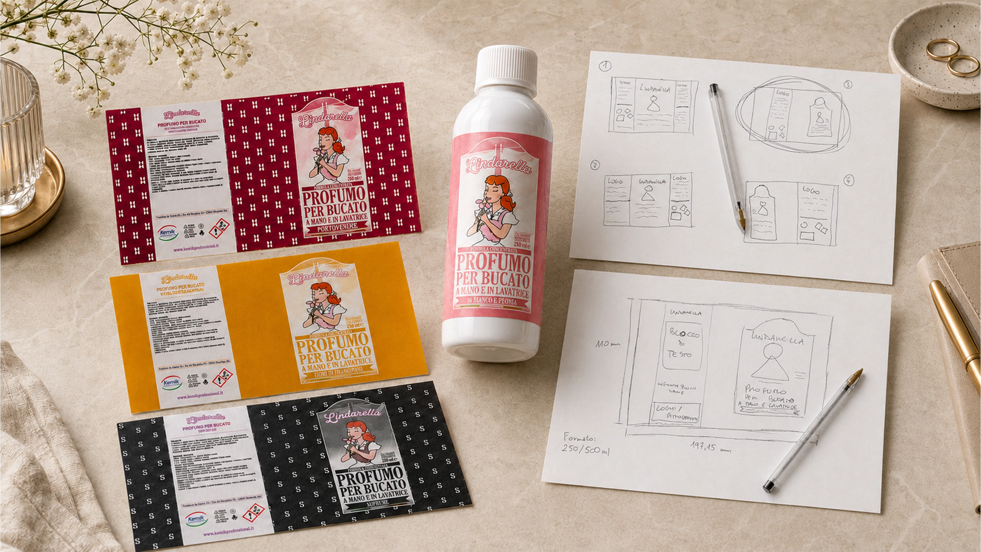
Kemix Industriale SRL commissioned a label system for a range of concentrated laundry fragrances available in 250 ml and 500 ml bottles. The work covered the layout, integration of the existing logo and mandatory product information, development of a colour and graphic system able to distinguish many fragrances, and preparation of the final print-ready files.
The range needed a recognisable market presence without introducing a new brand identity: the existing Lindarella logo had to remain part of the visual system.
The main challenge was creating labels that felt colourful without becoming excessive, with each fragrance and its scent notes taking visual priority. Colour, background motifs and graphic details had to differentiate the variants while preserving a coherent family look.
The system also needed enough flexibility to scale across more than 50 fragrances while maintaining clarity, hierarchy and recognisability as the range expanded.
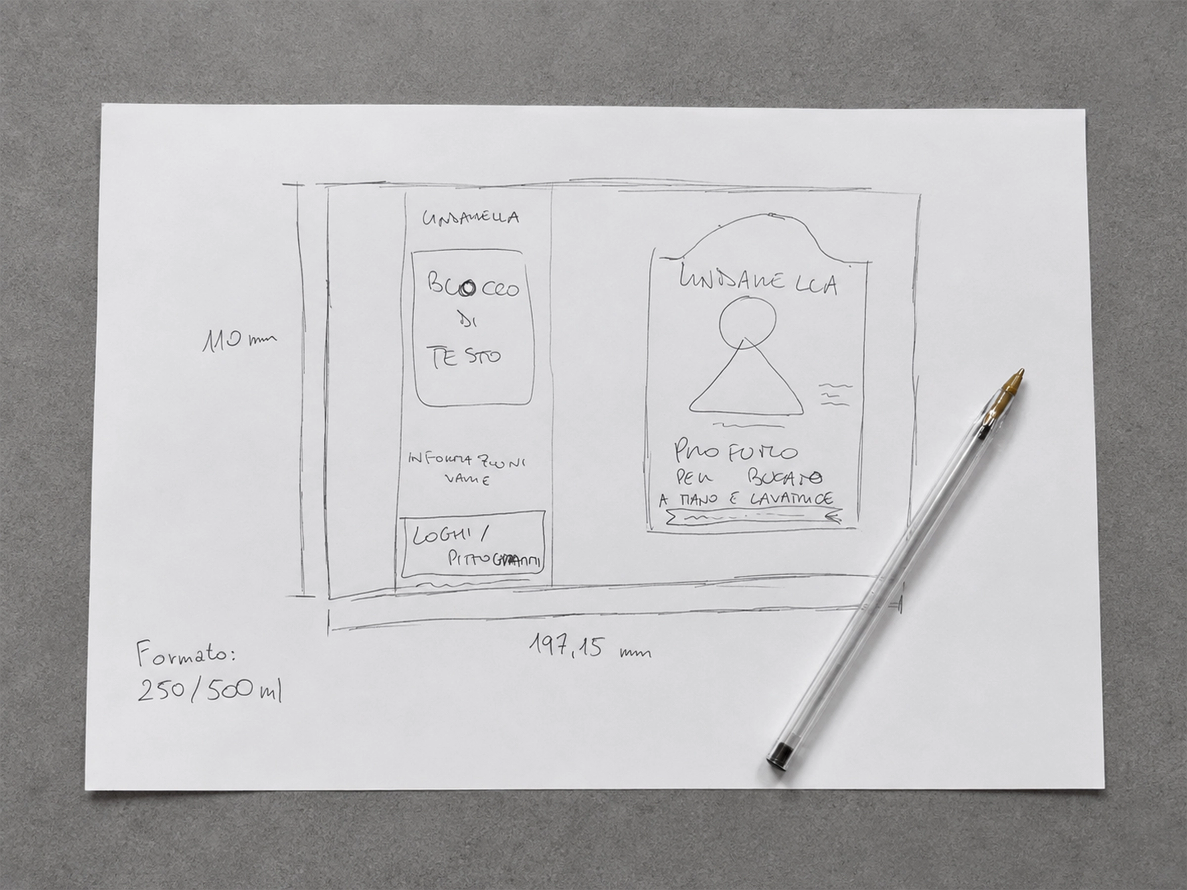
Both the 250 ml and 500 ml formats use a 197.15 × 110 mm label, so the composition had to make effective use of a fixed horizontal format.
The layout had to include the existing logo and the mandatory manufacturer and distributor information, without redesigning the brand identity itself.
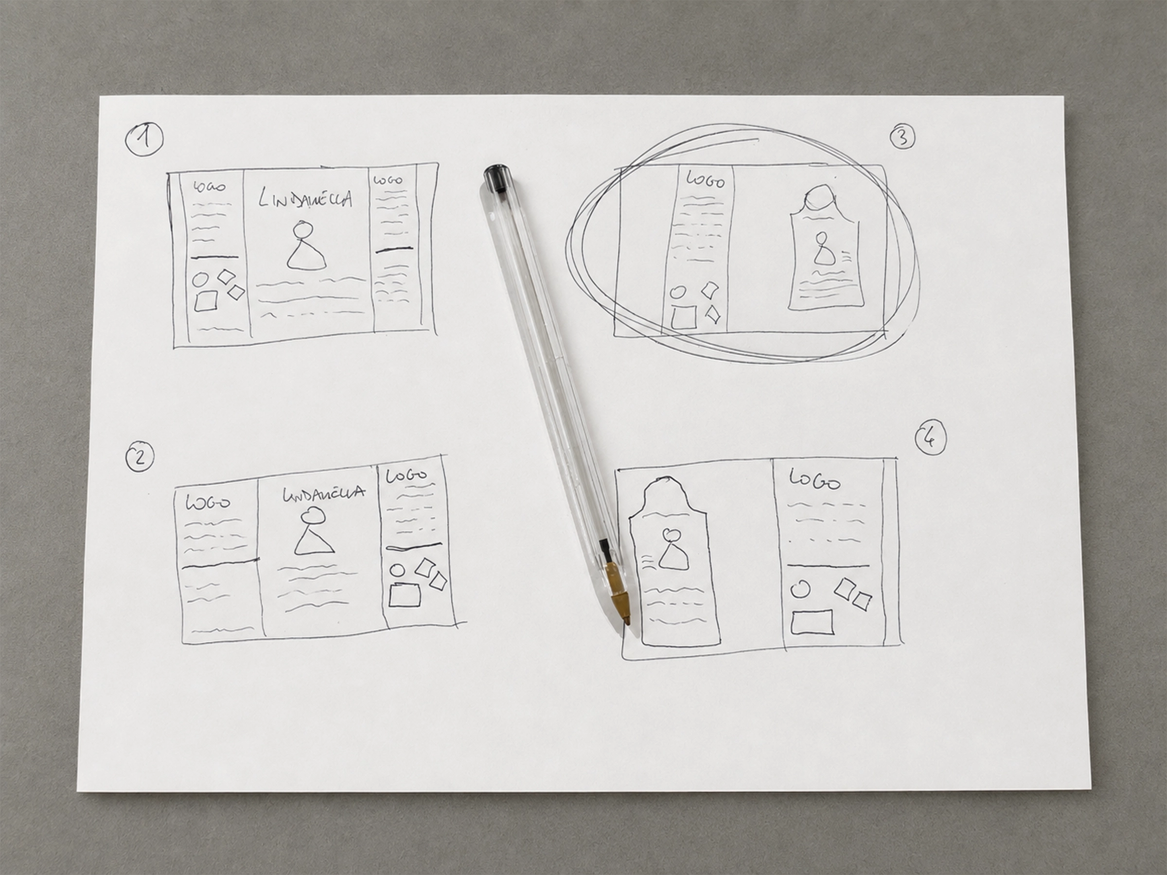
The process began with hand-drawn paper sketches based on the client's ideas and direction. This stage was used to explore composition, hierarchy and possible visual routes before moving into digital design.
The final layout was built around a shared structure, consistent typography and strong emphasis on the fragrance name. Colour, background motifs and visual references to scent notes became the variable elements used to give each essence its own character.
Once the system was established, the work continued through the many fragrance adaptations and the technical preparation of the files for print.
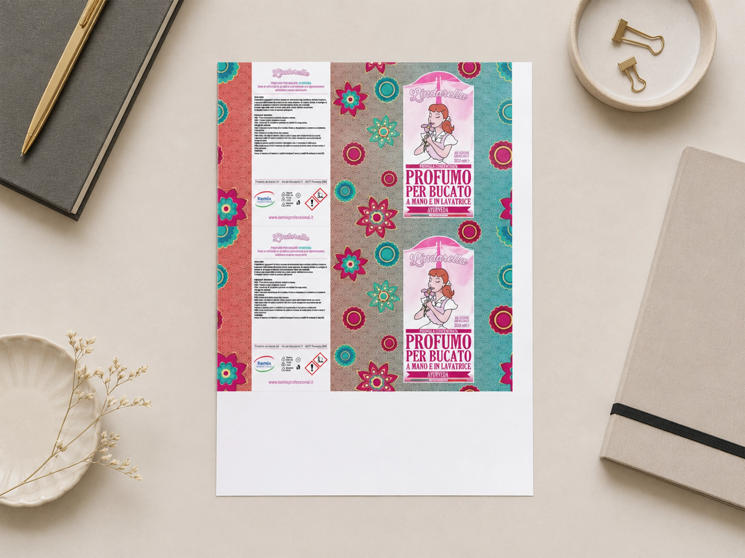
The project extended beyond the design of the individual labels. Final production PDFs were also prepared, arranging two labels per A4 sheet for both the 250 ml and 500 ml formats.
This made it possible to deliver files ready for the client's print workflow while keeping the many variants of the range consistent.
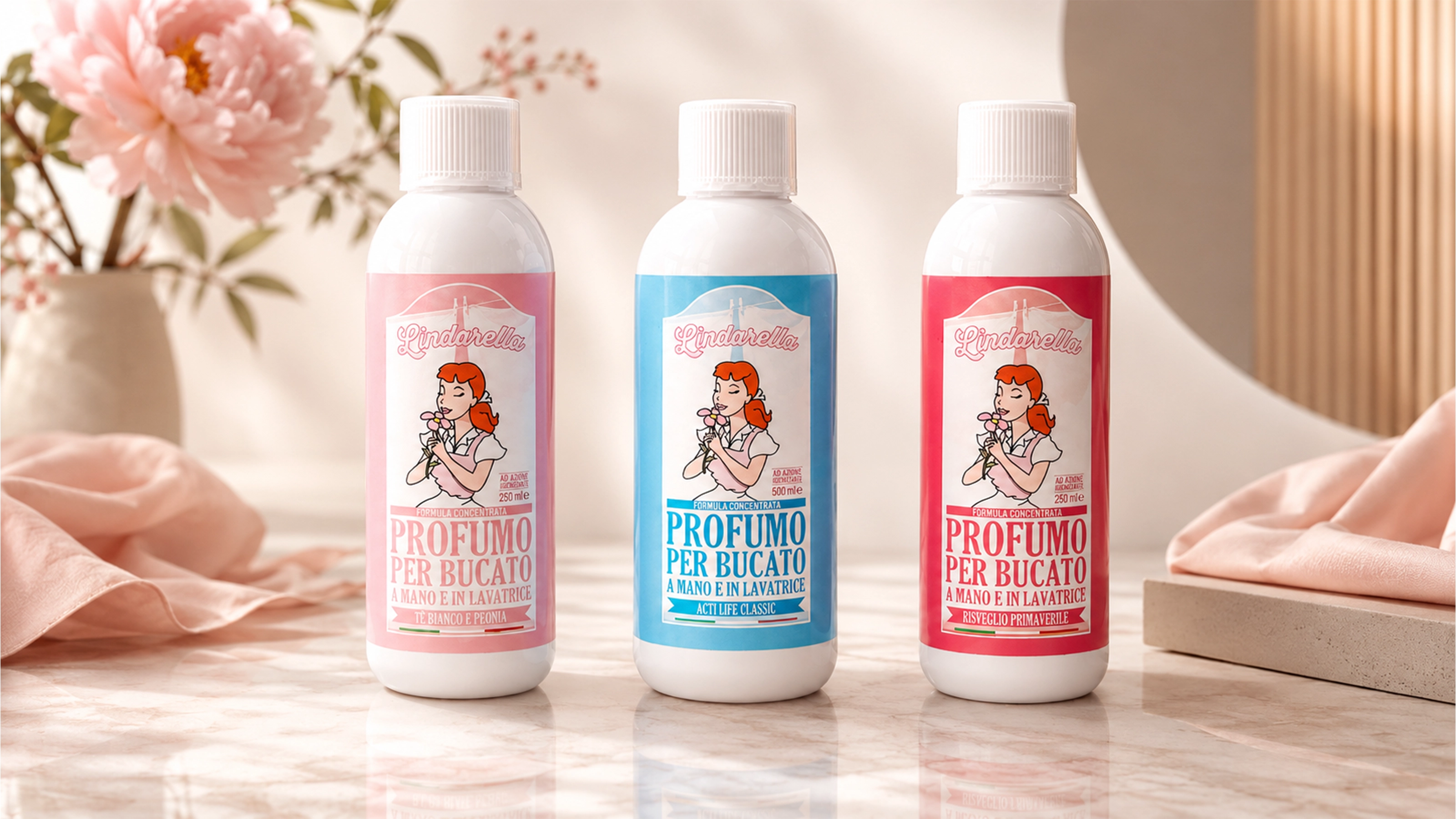
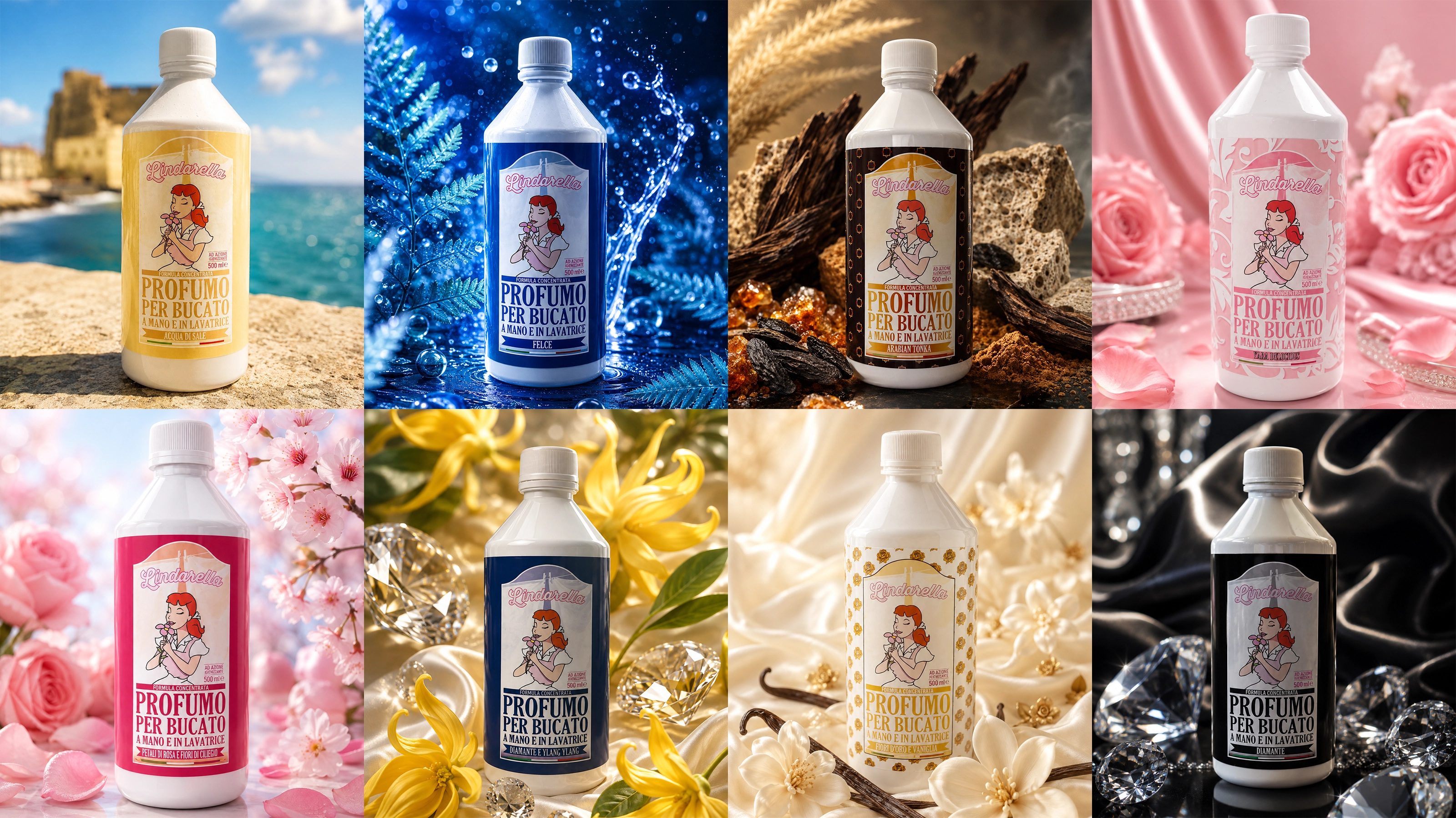
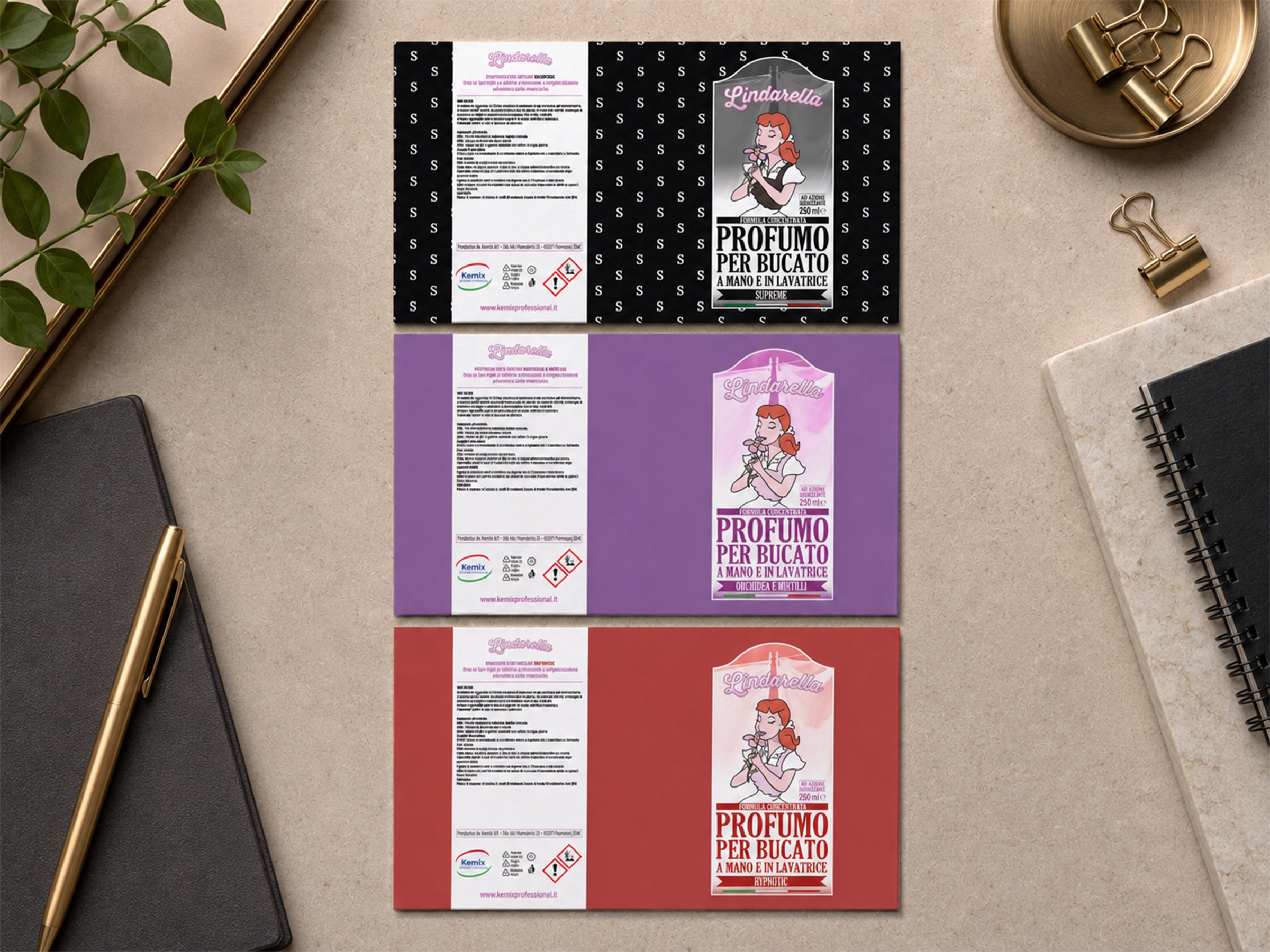
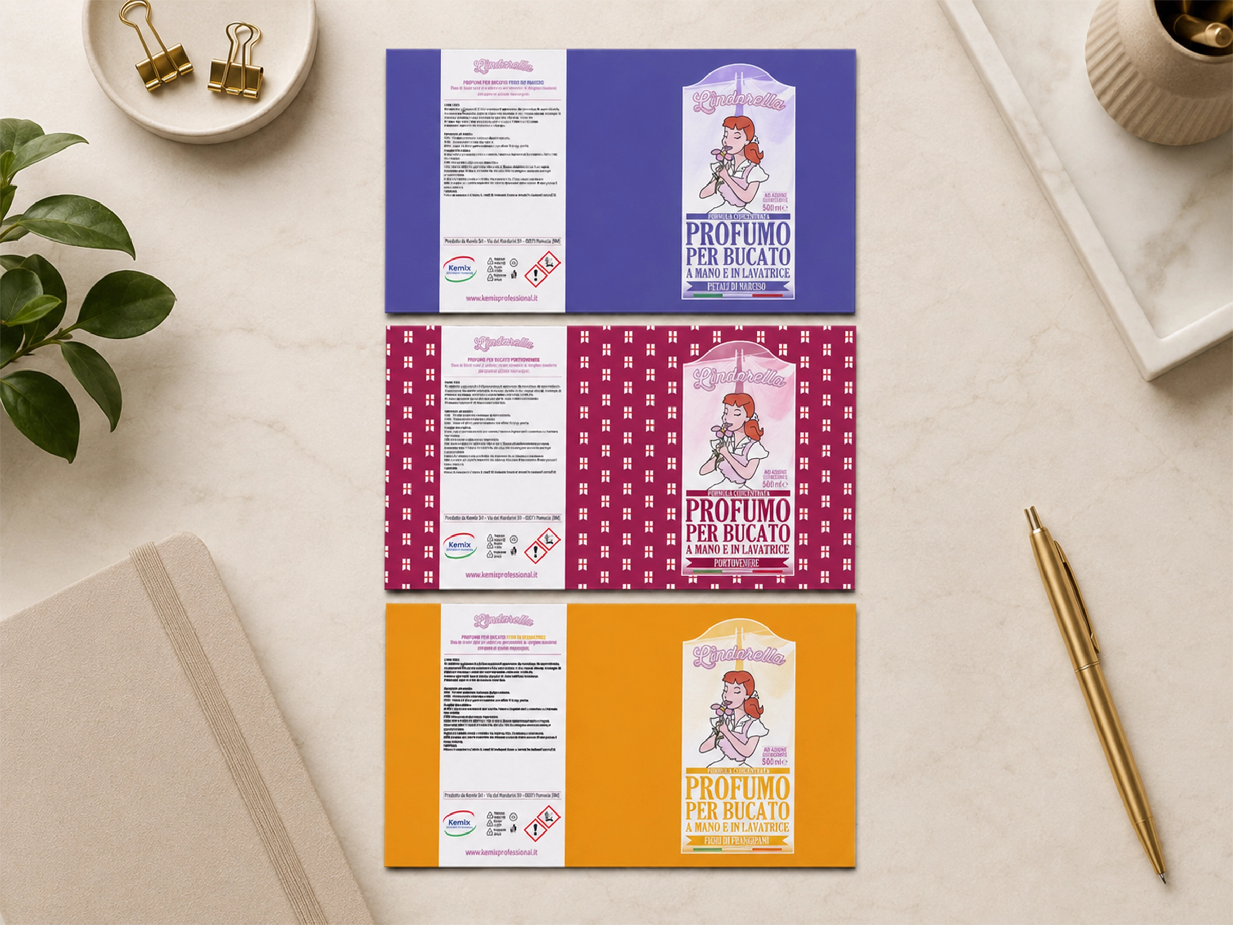
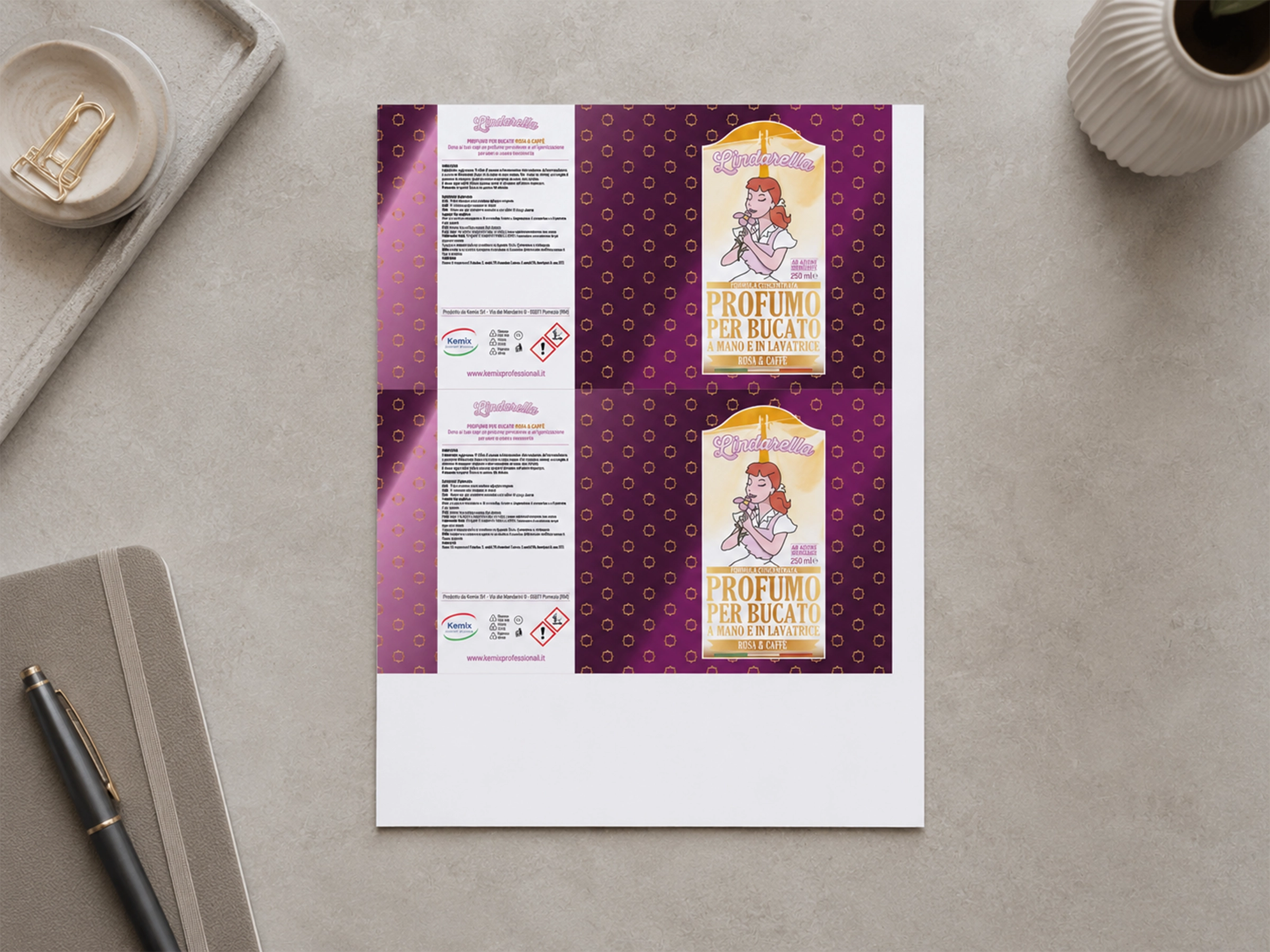
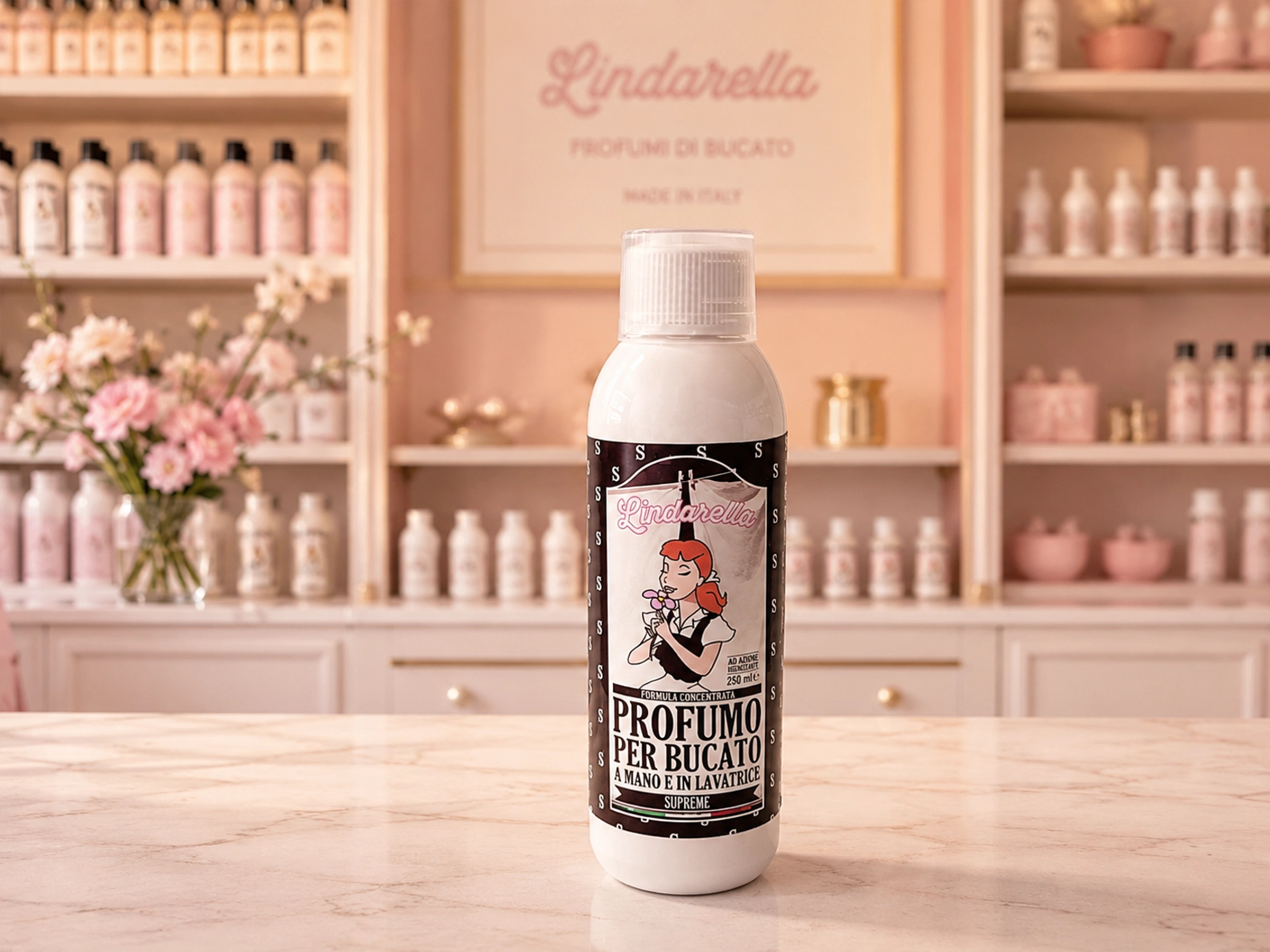
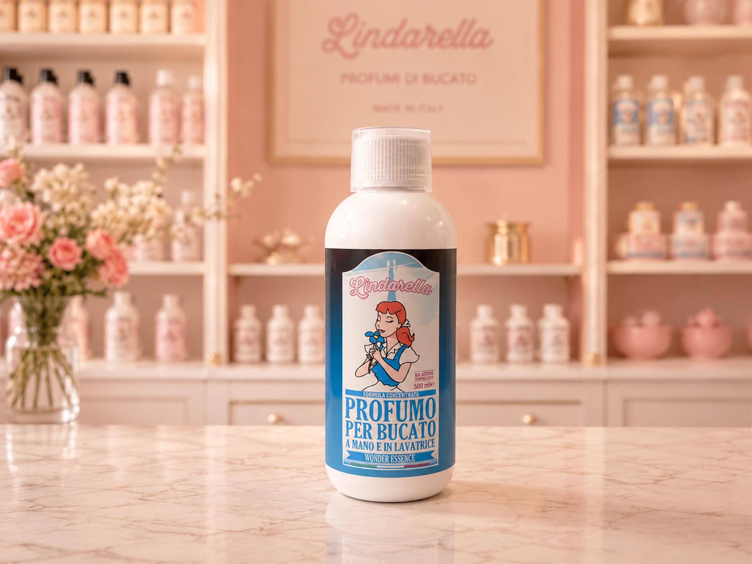
The labels were physically printed, applied to the 250 ml and 500 ml bottles and used on products commercially sold by Kemix Industriale SRL.
The system grew to more than 50 fragrances, maintaining a coherent visual structure while allowing each essence to develop its own colour and scent-led identity.